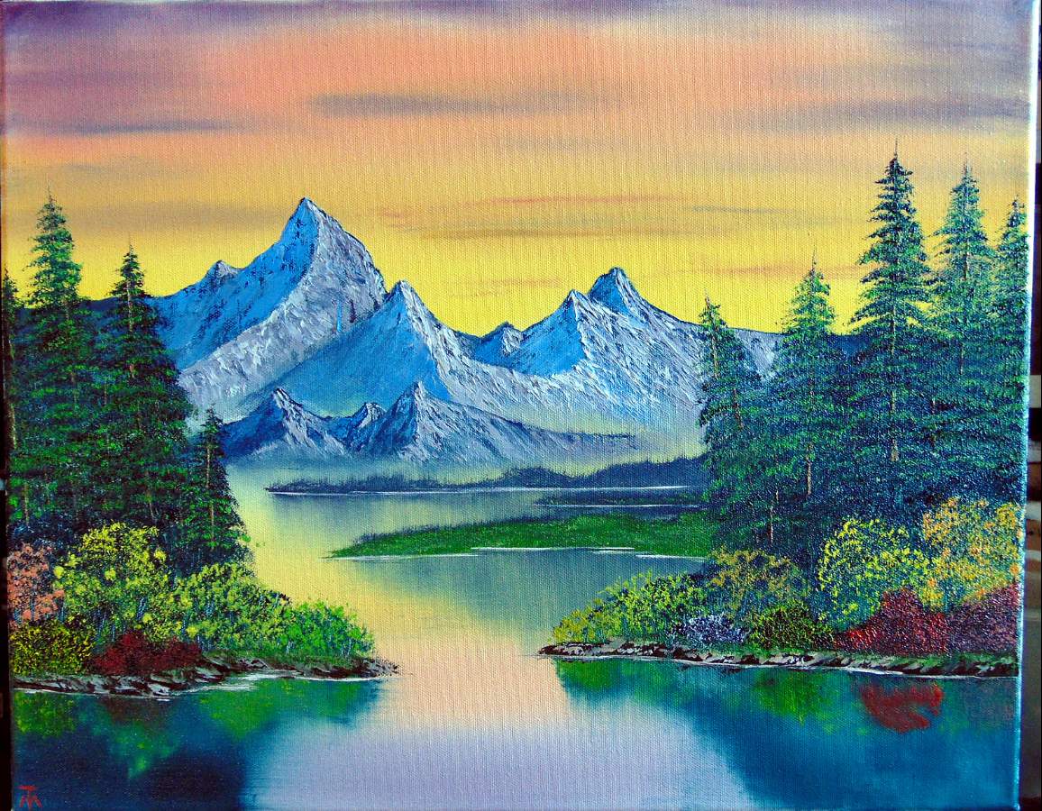
3/5/23 - Gray Mountain (s24e1)
EDIT: Added 3/8: Just a thought ... After completing my painting, and looking at a few dozen other versions of this painting, I think this painting would be way more effective as a portrait oriented painting rather than landscape orientation. My issue (to my eyes at least) is the depth of the painting. To my eye, in every version of this painting including Bob's original there is not room to adequately indicate depth and distance of the outcroppings. Bob's intent is to show far distance and tiny trees (1/4" upstrokes to indicate trees). I may just do this one again as a portrait oriented painting. Your thoughts would be appreciated concerning this point of composition, just out of curiosity. Another thought would be to move the mountain way up in the painting to get additional space, but that I think a larger sky is important to the overall effect of the painting.
I have found that I get about 3/4 of the way through a painting, then for some reason, I hurry to finish the final 1/4 of the painting. My foreground painting seems to be a bit lacking as a result.
Starting with this painting, I am going to start taking more time to just step back and evaluate my progress without hurrying to complete the painting.
I feel like this may be my best painting yet. The bushes seem to be a bit crowded still, but better than my usual.
16" x 20" canvas. 16x20 is becoming my favorite size canvas to paint. As always, your comments and suggestions (especially suggestions) are welcome.
Comments
I agree with jesse, those mountains are really gorgeous against that wonderful sky also! I will also add that perhaps your bushes seem crowded because of the multiple color variation. If they were all close to the same color, like in Bob's original, I think it would seem less busy.
Very nice Tony. Amazing how far you’ve come since you started your painting journey.
Thanks for the comments fellow painting peeps. Matt, you made my day!! Going to be smiling for a bit here. :)
Great painting Tony!!! You have improved so much in a short period of time! Love it!
I do run into that issue times to times. I started to take pictures once I am done with a part (specially for the background & mid ground). It works very well to see where you are at with your painting so you don’t run out of space. You can step back too. I will also take a break for 10-15 minutes. I don’t look at it during that time. So when I return to it, I can see clearly where to go from there. I
Yep those mountains are amazing. Well done!
Sign in to leave a comment.
Not a member yet?
Join over 6100 other painters and share your
paintings with the world!


Your mountains are fantastic! I totally understand rushing through the end though, sometimes I have that problem. One suggestion would be to stop after the mountains and foothills. Come back to it another day with fresh eyes and do the rest then. Also sometimes less is more. Bob only painted 5 evergreen trees in his version. If you only have a couple of trees it really makes you focus on making the most of the ones that are there!