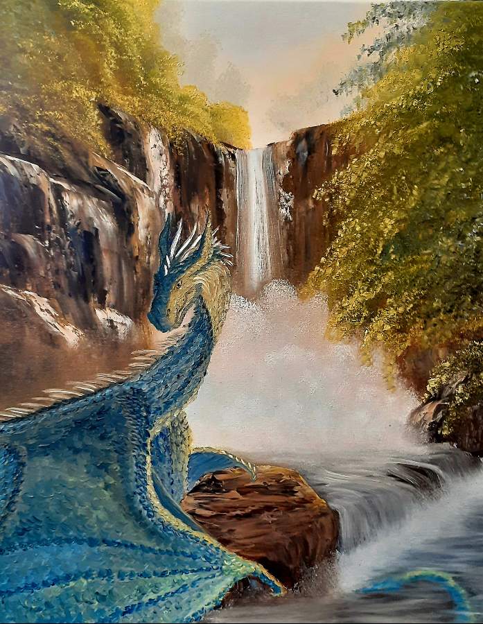
It's been awhile since I've posted anything. I painted my first dragon ever and would love advice on making it look less like an animation. More shadows and highlights? More muted colors?
Comments
Dragon is SUPER! As are the fall and the rocks!! Great idea for this creation!
I'm no animal expert (except for silhouettes) but I think more shadows might do the trick to improve the animal. Worth to try once perhaps? Good luck!
I would not say dragon looks like animation. He looks gorgeous!
From composition stand point I think he is not main subject in painting. The waterfall is. Also that highlight on the tree takes attention from the dragon.
I would suggest to add glaze on dragon to enhance shadows anyway , but also to reduce contrast of the waterfall and saturation of yellow on the left tree.
The head of dragon which is supposed to be focal point is lost versus dark rock, just add a touch of lighter glaze behind head.
I made article to show what I meant and you can notice that dragon stands out significantly and becomes the focal point.
Article is here:
https://www.twoinchbrush.com/articles/jeniferalbright-blue-dragon
wow! this is incredible!
Sign in to leave a comment.
Not a member yet?
Join over 6100 other painters and share your
paintings with the world!
This is so nice.