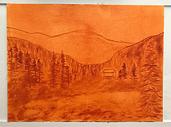

I was trying to create some interesting color in this landscape. It was a several day project.
Included is a photo of my initial Sienna drawing.
12 x 16 linen covered hardboard with Blue Ridge/MH oils.
Comments
Shadow, thank you for your kind comment, I’m pleased that you like the bright sky!
Ultra nice work! Love that sky😍
Very beautiful!
Beautiful job
I really like the background mountains! A lot of distance created here!
So very beautiful and an awesome sky!
Absolutely beautiful!! Everything about this is so well done!
Love this scene. Super pretty colors!
Very very nice painting. <3
The colours work very well together, also because you repeated some colours of the sky (mainly the yellow/orange) in other parts of the painting. And a little bit of green in the yellow field in the foreground. This makes it a whole.
Beautiful composition! I especially like the sky and foreground.
oh wow! these sky colors and light management in the scene is really great! Lovely work with aerial perspective! Great abstraction in the foreground. I would only make it a tad darker because it argues with the sky and i cannot decide what is more important foreground or sky and eye jumps in between without the rest. If you cover bottom part with your hand you will see how eye travels to the mountains and to the sky, but when you open foreground the eye starts jumping between sky and the field and the impression of distance goes away. I think it is a beautiful painting ForestVue!
So beautiful! Everyone else has such wonderful comments to share - and I agree! Referring to Sunnylady's comment, I am not sure that the sky and foreground compete with each other as much in my mind, but a little bit. There looks to be a very natural "fix" by continuing the light area in front of the cabin out toward the foreground with a path that gets lighter toward the foreground until they connect. It would draw your eye back up into the painting. It almost looks like the path is meant to be there. A fantastic painting!!
Great colors!
Thanks to all for the kind comments and suggestions! Sunnylady and Flippergirl thanks for your suggestions. I was fixated on the foreground situation and darkened it several times. I envisioned the cabin and middle ground in the shadow of the mountains with light beginning to glow near the cabin. I see the foreground on the uphill which I may not have captured adequately. Looking at it I definitely could have highlighted more in the middle ground and further darkened the foreground to make for a better flow. Appreciate your observations!
Fantastic depth, wonderful painting.
No problems at all. I would suggest to use glazing when painting is dry. So if you don’t like something you can erase with soft cloth
Hi ForestVue, just today this awesome guy posted the video about what you worked hard in your painting . I really love his art tutorials.
https://youtu.be/7tgoKWYX1HM?si=Q_MqL68n5H5BuOFf
Hello Sunnylady, thank you for the tip. I checked out a couple of his videos and I like him too! I used the block in on this painting that I'd learned from Chuck Black and have found that process very helpful. I will definitely explore more of these videos. Thanks again!
Sign in to leave a comment.
Not a member yet?
Join over 6100 other painters and share your
paintings with the world!
That is… so… PRETTY! Serious paint job my friend. Wow that sky… I’m jealous!