Thanks for the comments. I changed a few things to add perspective. Hope it worked out
Comments
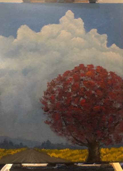
I think the view is very realistic here, the way you worked with cloud, and how gentle is that hill far away and how purple gray it is and those misty trees (of green gray) far away, the grass on the side of the road that also becomes more dull in color with the distance. There is wonderful depth and perspective here. The way you made the road adds this incredible feeling that viewer is travelling by the car.
The only what bothers me is tree color, but what is perfect is the shape of the tree (read as shadows and highlights are perfect). Even the color is taking all the attention from the rest, this tree is part of the painting as colors are muted and nicely arranged.
I also think starting at time of this painting you found your way with the skies, this big thick clouds are very nicely done in may paintings after that.
Very thoughtful comments that I appreciate very much. Thanks as I really enjoyed painting this one.
I was thinking about your comments- it's always tricky with red since it is such a strong color, a touch goes a long way. I started the first layer with raw umber, ultramarine blue and then added Cad red medium. I slowly transitioned as the layers built with less dark and more red using combinations of cad red med, cad red light, Quinacridone red & Napthol crimson
Yeah, thanks for these additional details! this is exactly why the color there is complex. I see you have dark undelayer and then this bright orange spots, but in fact it is cad red medium? So there is distortion from the artificial light there I guess. As cad red is slightly different. Is it on the photo as it is at a day light? Also you have incredible variety of colors in here and nice combinations to create variety. I think you also used this huge variety of red to make purples and greens on the back ground, correct? This may explain why tree does not look foreign, however takes a lot of attention.
I would love to see it in real life as photos play tricks many times with us.
-----
On separate note my instructor was grilling me over the poor color variety within one shape and you do it so unintentionally. I think this is natural vision for it you got.
I agree about red. It is difficult to incorporate in the painting. Probably because not too many reds around us in nature through the year. The most red I used was in the fall painting I did with pallet knife. So it was difficult and I think I do not have enough shape in the trees there. But your tree has the shape and as you said huge variety of red. Awesome.
If you look closely at the top I also put a few cad yellow med highlights to highlight the light source.
Sign in to leave a comment.
Not a member yet?
Join over 6100 other painters and share your
paintings with the world!


Great composition! Feels like the background painting in an anime, very beautiful